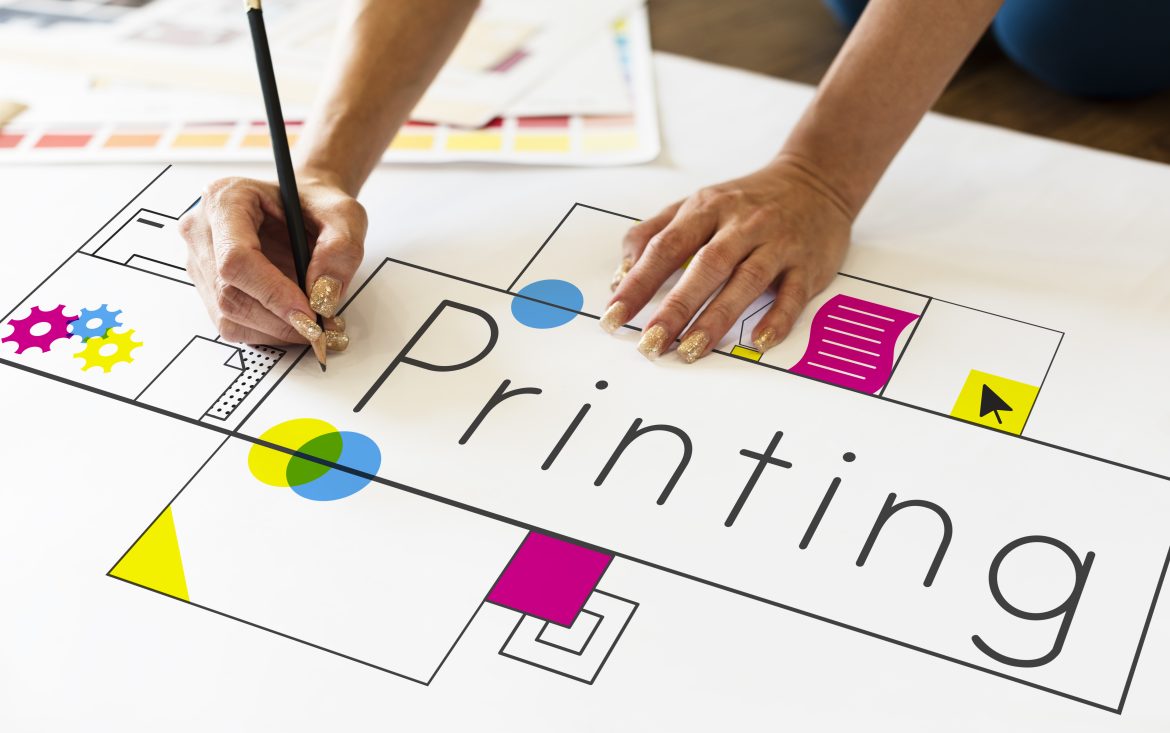
Designing effective print materials requires careful consideration of various elements to ensure your message is conveyed clearly and your audience is engaged. Whether you’re creating business cards, brochures, banners, posters, apparel, or any other print materials, following our print design guidelines will help you achieve impactful results. At iPrints, our aim is to help our esteem customers create effective print designs that capture attention and convey the rightful information in a clear and compelling manner.
Designing professional-looking printed materials can be a challenge task for many, especially for those who do not have the design expertise. Our printing company has solved this problem by offering an integrated web-to-print solution which allows customers to create and order customized print products online through our web store. This online design tool has streamlined the print ordering process by enabling users to design, preview, and submit print-ready files while placing their orders on the products page. Web-to-print (W2P) incorporates a wide range of professionally designed templates, text editing features, image upload, and other design elements to make the designing process easy.
Whether you need a logo, business card, or postcard, the free design templates can be easily customized to fit into your brand and specific needs, saving you the money in hiring a graphic designer to do the job; and the time or efforts in creating designs from scratch. You can create a cohesive and visually appealing brand identity or custom print design with just few clicks. You can easily add and edit text, insert images, customize colors and fonts. Our user-friendly online design tools also provide the option to save your artworks for later editing or sharing with colleagues. You can give it a try today. Now, here is our step-by-step guide on how to create eye-catching designs for your printing jobs.
How To Create Professional-looking Printed Materials:
1. Define Your Purpose and Audience:
Before diving into the design process, clearly define the objectives of your print material. Understand the message you want to convey, the target audience, and the desired response. Tailor your design to resonate with your target audience. Consider their preferences, demographics, and interests. A design that appeals to a specific audience is more likely to be effective in conveying your message. Understanding the goal of your print materials and the preferences of your audience will guide all your design decisions.
2. Keep Your Design Simple and Clear:
In creative industry, ‘less is more’ they say. Which is a paradox meaning that ‘what is of smaller quantity could be of higher quality’. That is: what is less complicated is often better understood and more appreciated than what is more complicated. Thus, simplicity is key in print design. Avoid clutter and overwhelming designs. Focus on a clear message and use concise text. A clutter-free design helps viewers quickly understand your message and increases the likelihood of engagement. You can create a visual hierarchy to guide the viewer by using font sizes, colors, and placement to emphasize key elements. Important information should stand out, making it easy for readers to follow the intended flow.
3. Choose the Right Color Palette and Typography:
Colors play a significant role in print design. Select a color palette that aligns with your brand and resonates with your target audience. Consider the psychological impact of colors and use them strategically to evoke the desired emotions. Ensure there is enough contrast between background and text for readability. Choose fonts that are easy to read both in print and at a glance. Stick to a maximum of two or three font styles to maintain consistency in your design. Use bold font and italic variations to emphasize important points. Maintain consistency in font usage throughout the design, using different fonts for headings and body text to create a hierarchy.
4. Consider Layout, Composition and Bleed:
Organize your content in a visually appealing and logical manner. Create a hierarchy of information using elements such as headings, subheadings, and bullet points. Ensure there is enough white space to prevent overcrowding and enhance readability. If your design extends to the edge of the paper, incorporate bleed into your layout. In printing, bleed refers to space off the edge(s) of a printed piece. Any printed elements; be it photos, color blocks, or text must extend 0.125 inches beyond the trimmed edge of the piece. Bleed ensures that there is no white border after trimming or cutting your finished jobs. Additionally, you can include trim marks to guide the printer on where to cut, this will ensure that your design is printed accurately and professionally. Again, different printing methods and materials may have specific requirements. Be aware of the standard paper size, orientation, and format that your project supports. Communicate with our printing service providers to understand their specifications and agree for optimal results.
5. Incorporate High-Quality Images:
‘Image is everything’ in print production. Always ensure that all the images used in your print design are of high resolution. Low-quality images can result in a blurry or pixelated final product. Aim for images with a resolution of at least 300 dots per inch (DPI) to guarantee sharp and clear prints. Here is the simplest ways to find your image DPI on a computer:
- On Windows, right-click the image and click “Properties.” Click the “Details” tab and find the DPI value under the “Image” sub-header.
- Alternatively, open the image in Microsoft Paint. Click “File” and then “Properties.” Find “Resolution.”
- On Mac, open the image in “Preview.” Click “Tools” and then “Show Inspector.” Find the “Image DPI.”
6. Accessibility, Legal and Copyright Compliance:
We creating a design, we asked that you design with accessibility in mind. This is to ensure that your print material is easily readable for individuals with visual impairments or color blindness. Use high-contrast color combinations and legible font sizes for better inclusivity. Where applicable, ensure that your print design complies with copyright laws and regulations by obtaining proper licenses for images used, fonts, and any other elements that may be subject to intellectual property rights. This step is very crucial to avoid legal issues. By sending your print-ready files to us, you agreed that you are the original owner of the content you sent and that you exonerated iPrints.com.ng (or the organisation) from any legal claims that may arise due to your use of unlicensed materials. Please read our Terms and Conditions.
7. Choose Quality Paper and Print Finishes:
Your choice of paper and finishes can significantly impact the perceived quality of your print materials. Select a paper type that complements your design and consider finishes like gloss or matte for added visual appeal. Selecting the right types of printing paper stock is crucial. Consider factors like thickness, print finishes, and texture that complement your design. Additionally, use high-quality printing methods to ensure that your design is faithfully reproduced on the final product. Another thing you must not forget to include in your design is call to action (CTA). Clearly state the action you want the reader to take via your design. Whether it’s visiting a website, making a purchase, or contacting you, endeavor to include the information in your design. A compelling call to action encourages engagement and helps you measure the success of your print advertorials.
8. Test and Review Your Print Designs:
Before finalizing your design, always request a test printing and proofreading. These steps allow you to identify any issues with colors, alignment, spelling or resolution. Testing ensures that the final product meets your expectations and is ready for mass production. While thoroughly proofreading all text content again will help you avoid costly mistakes. Check for typos and grammatical errors which can undermine the professionalism of your print material. Seek the help of other people like your friends to help you proofread your design or hire a professional proofreader to ensure accuracy. Check print color accuracy, color matching and ensure all elements are positioned correctly. Testing helps catch potential issues before mass production. Regularly evaluating and updating your designs will ensure your design stay relevant and make the most impact in your marketing efforts.
Wrapping up: The Ultimate Print Design Guidelines
Print design is a crucial aspect of visual communication, encompassing a wide range of materials such as brochures, posters, business cards, and more. Effective print design not only captures attention but also conveys information in a clear, colorful and compelling manner. This post is designed to provide comprehensive print design guidelines for customers or graphic designers who want to ensure the creation of professional artworks that meets the necessary print syandards. Our free online design tool is also available to help designers achieve the best results.
Successful print material design involves a thoughtful combination of purpose, simplicity, hierarchy, color, typography, imagery, consistency, layout, paper quality, a strong call to action and compliance requirements. When creating impactful and professional-looking printed materials, use your brand colors, company logo, and other visual elements consistently to establish a strong brand presence. This approach helps in creating a cohesive brand identity and reinforces brand recognition.
By following these comprehensive print design guidelines, individuals, businesses and organizations can create visually stunning and effective printed materials with ease. From defining their objectives to ensuring technical specifications are met, each step contributes to the overall success of the print design process. Remember to collaborate with our experienced printers and production professional to help evaluate your print design strategy before going to the printing press. Contact us now for free design ideas, our dedicated customer support team is ready to assist you at every stage of the journey.

