-
iPrints
- No Comments
Here is a step-by-step guide on how to choose best CMYK Colors for Print Design. Choosing the best colors for print design is a crucial aspect of creating visually appealing and effective printed materials. The right color palette can enhance readability, convey emotions, and leave a lasting impression on the audience. In this comprehensive guide, we’ll explore the key factors to consider when selecting colors for print design, providing practical tips and insights to help you make informed decisions.
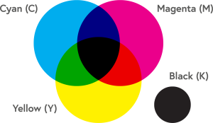
Color plays a crucial role in various fields, including graphic design, printing, and digital media. In the realm of print design, the CMYK color model is widely used to achieve a broad spectrum of colors. CMYK stands for Cyan, Magenta, Yellow, and Key (black), and it represents the primary colors used in color printing. In this guide, we will explore CMYK color charts and values, delving into the fundamentals, applications, and the significance of understanding CMYK color in the creative process. Below is our CMYK Color Guide:
How To Choose Best CMYK Colors for Print Design:
#1. Understand the CMYK Color Model:
 Before diving into the specifics of print design, it’s essential to grasp the fundamentals of color theory. The color wheel, comprising primary, secondary, and tertiary colors, serves as the foundation. Understanding the relationships between these colors, such as complementary, analogous, and triadic schemes, is crucial for creating harmonious and balanced designs. The CMYK color model is subtractive, meaning colors are created by subtracting varying percentages of light-absorbing inks. Unlike the RGB color model used in digital displays, where colors are created by combining light, CMYK is suitable for the printing process. Each color in the CMYK model is assigned a percentage value, ranging from 0% (no color) to 100% (full color saturation). RGB colors refer to red-green-blue, which are the “additive colors”. RGB color scheme is used for anything on a screen, because the screen light shows us the colors. The screen doesn’t absorb anything like the paper does.
- Cyan (C): Cyan is a blue-green color, and it is one of the primary colors in the CMYK model. In printing, cyan absorbs red light, making it an essential component in creating a wide range of colors.
- Magenta (M): Magenta is a purplish-red color that absorbs green light. When combined with cyan, it produces various shades, including blues and purples.
- Yellow (Y): Yellow absorbs blue light, and it is the third primary color in the CMYK model. When combined with cyan and magenta, it completes the primary color set, enabling the reproduction of a diverse spectrum of hues.
- Key (K) or Black: The key component, represented by the letter K, stands for black. It is added to the CMY components to enhance contrast and achieve richer blacks in the final print.
#2. Create CMYK Color Charts and Values:
Graphic designers often use CMYK color charts to visualize and select specific colors for their projects. These charts typically display a grid of color swatches, each labeled with its corresponding CMYK values. As a designer or organisation, creating your own CMYK color chart can be a valuable exercise for familiarizing yourself with the color model and honing your color-matching skills. Here is how to create a CMYK color chart. You can use the sample CMYK color chart below to get started:
- Divide a canvas into a grid: Create a grid structure with rows and columns, ensuring each cell represents a unique color swatch.
- Assign CMYK values: Fill each cell with a color determined by specific CMYK values. Start with primary colors and gradually blend them to create secondary and tertiary colors.
- Label each swatch: Annotate each swatch or cell with its corresponding CMYK values for easy reference.
Download iPRINTS CMYK Colour Charts and Values
Colors can appear differently on different screens as compared to the final printed result. Therefore, our printing company has provided a well-designed color charts in PDF format to assist designers in selecting the correct CMYK values. Download iPrints CMYK Colour Charts and Values for FREE! This color guide contains a series of color charts that are known to be reliably produced using CMYK offset printing. The CMYK suggested values by iPrints would give you good results in your printing projects.
You May Like: 10 Types of Printing Machines and Their Uses
#3. Consider your Brand and the Message
Now that you have created your own CMYK color chart, the next step is to choose the right colors for print design. To do this, you need to consider the brand identity and the message you want to convey. Align the color palette with the brand’s personality and values. For example, vibrant and bold colors may be suitable for a youthful and energetic brand, while muted tones could convey a more sophisticated and professional image. The CMYK Color Charts can be applicable to your print materials such as:
- Print Design: CMYK is the standard color model for the print industry. Designers use CMYK color charts to select precise colors for brochures, posters, business cards, and other printed materials.
- Corporate Branding: Companies often have specific brand colors that need to be reproduced consistently across various media. CMYK color charts assist designers in achieving accurate color representation in branding materials. So, its advisable for you to keep a brand color chat.
- Packaging Design: Packaging design requires meticulous color choices to ensure that the printed packaging accurately reflects the intended brand image. CMYK color charts aid in this process by providing a reference for color accuracy.
- Fine Art and Canvas Printing: Artists who reproduce their work through print use CMYK color charts to ensure that the colors in their prints closely match the original artwork.
#4. Choose the Best Printing Technology
Understanding the capabilities and limitations of the printing technology you are using is essential. Different printing methods, such as offset lithography, digital printing, or screen printing, may yield variations in color reproduction. Therefore, discussing color options with your printer and obtaining color proofs can help ensure accurate color representation, color matching and consistency in the final printed piece. While CMYK is a powerful color model used in printing industry, here are some challenges and considerations to keep in mind. This knowledge will help you learn how to choose best CMYK Colors for Print Design:
- Color Limitations: CMYK has a more limited color gamut compared to RGB. Some vibrant and neon colors may not reproduce accurately in print press.
- Color Calibration: Printers, monitors, and other devices can vary in color calibration. It’s crucial to calibrate equipment regularly to maintain color consistency.
- Black Generation Methods: Designers must choose between different black generation methods (rich black, pure black, etc.) based on the desired result and printing conditions.
#5. Test your Colors with a Limited Palette
Knowing your target audience is crucial when selecting colors. Different demographics (age, gender, region) respond to colors in unique ways. For instance, younger audiences may be drawn to bright and vivid colors, while a more mature audience may prefer subtler tones. Again, consider cultural factors as well, as colors can carry different meanings in various societies. While it might be tempting to use a wide range of colors, it’s often more effective to work with a limited palette. Too many colors can overwhelm the viewer and dilute the impact of your design or message. Experiment with a few key colors that complement each other, ensuring a cohesive and visually appealing outcome. Contrast is a powerful tool in print design so use it wisely. It enhances readability and draws attention to specific elements. Ensure there’s enough contrast between text and background colors for readability. Experiment with light and dark shades to create a visually engaging composition while maintaining clarity.
Related: How to Become A Graphic Designer In 5 Steps
#6. Use a Professional Design Software
It’s advised to prioritize accessibility by ensuring that color choices do not compromise readability, especially for individuals with color vision deficiencies. Use sufficient color contrast and consider incorporating textures or patterns to convey information without relying solely on color. Colors evoke emotions and can influence perceptions. Red may symbolize passion or urgency, while blue conveys trust and calmness. Color psychology considers the psychological impact of colors in relation to the message you want to convey. Balance contrasting emotions to create a nuanced and resonant design. Additionally, investing in professional graphic design software, such as Adobe Creative Cloud, provides access to advanced color management tools. These tools allow precise control over color selection, ensuring consistency across various print materials and formats. You don’t know how to choose best CMYK Colors for Print Design? Hire experienced graphic designers to do the job.
Wrapping Up: Exploring CMYK Color Charts and Values.
Choosing the best colors for your printing involves a thoughtful and strategic approach. As an individual or company, this post highlights the fundamentals of color theory, how to align color palette with your brand identity or logo design, understanding printing technology, and being mindful of your target audience. With this knowledge, you can experiment with contrast, leverage color psychology, prioritize accessibility, and use professional design software or designers for optimal results. By incorporating these considerations into your color selection process, you can create print designs that captivate, communicate effectively, and leave a lasting impression.
As a printing company in Lagos Nigeria, we use the right CMYK color charts and values so that designers working in print and related industries will make informed decisions. You can contact us for more information on choosing the right colors for your print job. We have a solid understanding of the CMYK color model, along with the ability to create and interpret CMYK color charts. We empower our designers to make informed color choices, ensuring accurate and consistent results in their printed projects. As technology continues to advance, staying informed about color management and printing techniques remains crucial to us for achieving optimal results in the world of print design.


